Color Wheel and Power of Colors
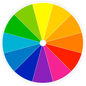
Colour of an object is not actually within the object itself. Rather, colour is in the light that shines, absorbs and reflect in different wave length. Light and colour are seen by the human eye because of two types of photoreceptor cell-rods and cones located in the retina of the eye. Rods are sensitive to light and dark cones are sensitive to red, green and blue light and responsible for colour version. These photoreceptors convey the colour of light to our brain. A colour wheel or colour circle is an abstract illustrative organization of colour around a circle that shows relationship between primary, secondary and tertiary colours. Some sources use the term colour wheel and colour circle interchangeably, however one term or the other may be accurate in certain field or certain version as mentioned above. The arrangement of color around the colour circle is often considered to be in correspondence with the wave length of light as opposed to hues, in accordance with the original color circle of Isaac Newton. Modern color circle includes the purple, however between red and violet. Color scientists and psychologist use the additive primaries red, green, blue and often refer to their arrangement around circle as a color as opposed to a colour wheel.
Effects & Powers of Colours
Colour is one of the most powerful elements. It has tremendous expressive qualities. Undertaking the uses of color is crucial to effective composition in design and fine arts. The word color is the general term which applied to the whole subject red, orange, yellow, green, blue, violet, black and white and all possible combination thereof. Hue is the correct word to use to refer to just the pure spectrum color. Any colour can be described in term of its value and hue. In addition the various physical phenomena and psychological effect combine to effect our perception of a color.Hue & Value of Colors
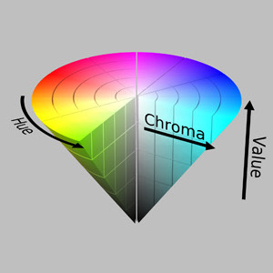
Value is defined as relative lightness or darkness of a color. It is an important part for a designer artist in the way that it defines from and creates spatial illusions. Contrast of value separates object in space while gradation of value suggests mass and contour of contiguous surface. Hue has also value. Hue is the term for the pure spectrum colors commonly referred to be the 'Colour names' red, orange, yellow, blue, green, voilet which appear in the circle or rainbow, theoretically result in black. Therefore pigment mixture is sometimes referred to as subtractive mixture. The colour wheel is the basic tool for combining colors. The first color diagram was designed by Sir Isaac Newton in 1666. The color wheel is designed so that virtually any color you pick from it will look good together. Over the years, many variations of the basic design have been made but the most common version is wheel of 12 Colors based on the RVB (or artistic) colour model. Traditionally, there are a number of color combination that are considered especially pleasing. These are called color harmonies or color chords and they consist of 2 or more color with a fixed relation in the colour wheel.
Primary, Secondary, Tertiary & Supplementary Colours

- Primary ColoursColors at their basic essence; those colours that cannot be created by mixing others.
- Secondary ColoursTheses are acheived by a mixture of 2 Primary Colours.
- Tertiary ColoursThese are acheived by a mixture of Primary and Secondary hues.
- Supplementary ColoursThese are located opposite to each other on a Color Wheel.
Tints, Tones & Shades of a Colour
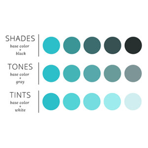
These terms are often used incorrectly. Although they decide fairly simple color concepts.
- ShadesIf black is added, the darker version is called a shade. It contains no white or gray. Shade darkens the color, but the hue remains the same.
- TonesTone of a colour is achieved if grey (equal amounts of black and white) is added is to pure colours. Adding grey to a color will make the intensity much duller.
- TintsIf a color is made lighter by adding white, the result is called tint. Pastel colors are generally tinted colors. Tinted color remains the same color, but it is paler than the original.
Colour Harmony - Basic Techniques of Creating a Color Wheel
Below shown are the basic color chord based on the color wheel.- Complementary Color SchemeColour thar are opposite to each other on the color wheel are considered to be complimentary color [Eg: Red and Green]. The high contrast of complementary color create a vibrant look especially when used at full saturation it is really bad for text.
- Analog Color SchemeAnalogous color scheme are color's that are next to each other on the color wheel. They usually match well and create comfortable design
- Triadic Color SchemeA triadic color scheme uses colors are evenly spaced around the color wheel. Triadic schemes tend to be quite vibrant, even if you use pale of unsaturated version of your hues.
- Split ComplementoryThe split complementary color scheme is a variation of the complementary color scheme. In addition to the base color it uses the 2 colors adjacent to its complimentory. The split complementary color scheme is often a good choices for brightness because it is difficult to mess up.
- Rectangle (Tetradic) Color SchemeThe rectangle or tetradic color scheme uses 4 colors arranged into two complementry pair. The rich color scheme offers plenty of possibilities for varation.
- Square Color SchemeThe square color scheme is similar to the rectangle but all four colors are spaced evenly around the color circle.
Colour Relationship
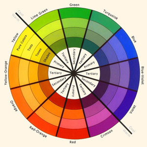
Color relationship may be displayed as a color wheel or a color triangle.
- The painter's color triangle consists of color we would often use in art class. The primary hue are red, blue and yellow.
- The painter's color triangle is the set of colours used in the printing process. The primaries are magenta, cyan and yellow.
- Nine-part harmonic triangle of Goethe begins with the painters primaries and the resulting tertiaries formed are dark neutrals.
Please leave your comments, we do love it!
Most Viewed Articles
Hey, we have amazing content on the latest Fashion, Trends, Style & Creative Arts, and now it's absolutely FREE for you.All you have to do, is just...We always respect your privacy!
Login / Sign-up
